
White Lady, Black Christ: The Making of a Book Cover
- Mil Flores
- May 31, 2021
- 3 min read
#IvanReverente is the illustrator and visual artist of the cover of White Lady, Black Christ. Here, Ivan takes us through the process of making the cover art and tells us what makes for a good cover, while giving future illustrators a few tips on illustrating for books.

1. Can you explain your process in creating the cover art for #WhiteLadyBlackChrist?
It was a series of trial and error. Since the book tackles religion, I knew I had to remain respectful in using religious iconography. I made a series of studies, trying to find the balance between my choice of elements. In this case, the image of the Nazarene and the white lady. Some of the questions I was grappling with were: Do I want to push for one dominant figure? If so, which one? In illustrating the White Lady, do I show her as an innocent image or someone that is a bit broken and distraught? Hopefully, I made a cover that is both respectful yet conjures a sense of mystery and intrigue.
2. How long did it take you to illustrate the cover? What effect were you going for?
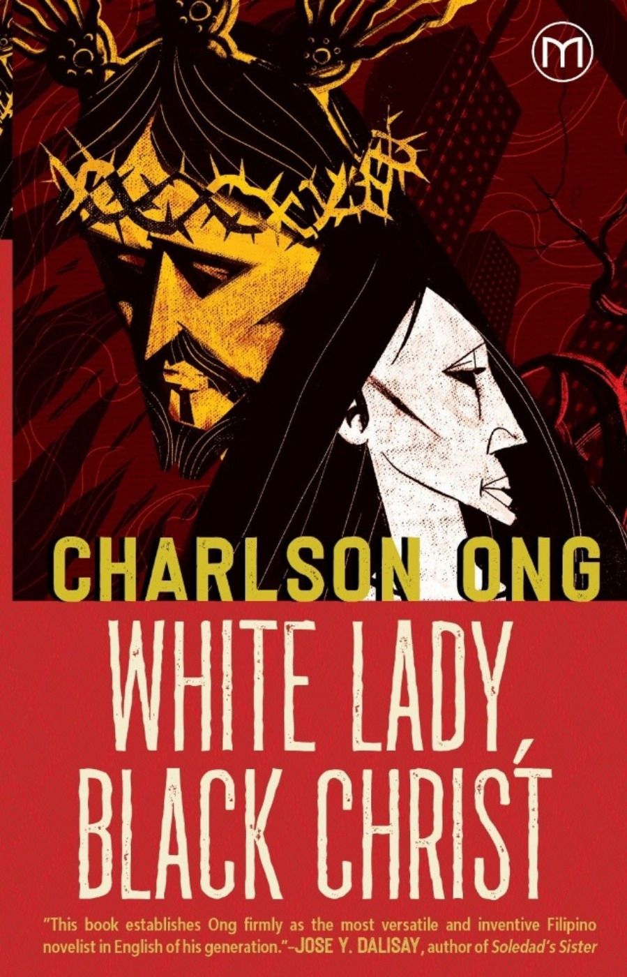
I took my time to create this cover. Knowing that it will have a religious figure in it, I needed to create an image that does not disrespect the image of the #Nazarene. After a lot of iterations, I decided to go with an image that shows the two main elements equally on the page. I was going for an image that tries to contain each other, like the yin and yang, but instead of having a natural flow, the hard and sharp geometric shapes feel like they are in a hard lockdown. The background also shows a faded city on its side, enveloped by thorns and fire. The overall goal is to create a sense of tension and feel of something that is not quite right.
3. What do you think makes for a good #bookcover?
I think a good book cover intrigues its intended audience. In some cases, it can give a feel of the tone of the story. It doesn’t give away too much that would be considered a #spoiler. It strives for attention but remains truthful to the essence of the book.
4. Do you read the manuscript first before you're able to make the cover art?
Ideally, yes, but in some cases where the production is tight, a few key chapters will do. It is important that the illustrator or designer has a grasp of the overall tone and feel of the book. Through the manuscript, we can sense the pacing of the story, how the language is presented, whether it has a casual or formal style, and other details that can guide us in the choice of what visual language to use. (A good brief from the publisher also helps.)
5. What struck you about the manuscript that found its way into the WLBC cover?
What struck me the most is that the manuscript was very cinematic. It felt like a movie. That inspired me to create a cover that had that same feeling/mood, like a movie in the mystery-thriller genre.
6. Any tips for aspiring book illustrators and artists?
Aspiring #bookillustrators and artists should be lifelong learners. Since we can be inspired by almost anything, we must consume other forms of art. Read books and enjoy that time away from the usual distractions of life. Watch movies, plays, and musicals. Give time to just listen to your favorite playlist or album, and think of how these make you feel. Also, don’t always focus on the how of things, it is easy to be consumed by the technique of making things. Try to give time to just ponder life, and see how things relate to each other. In this way, you will see opportunities that will connect to ideas and visual elements that you have never seen or thought of before. Know that there's no race to become an illustrator. Take your time, appreciate where you are right now. It may not be where you want to be but you are there, so make the most of it. Learn from it. And when you are ready to get back to the grind, we’ll see you again in the arena. Cheers!
Visit www.milflorespublishing.com/shop to get the book!


Comments